Dr Anna Smorąg — Esthetic Clinic
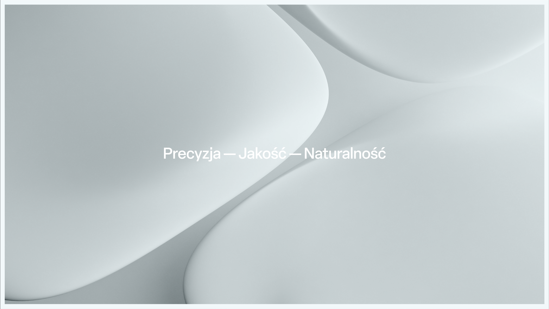
Precision, quality & naturalness
Dr Anna Smorąg’s Aesthetic Clinic in Warsaw is dedicated to enhancing each patient’s natural beauty. Led by Dr. Smorąg, the clinic combines medical expertise with aesthetic sensibility, offering treatments focused on skin regeneration, anti-aging prevention, and subtle facial correction — always respecting the individual features of each patient. The clinic’s philosophy is rooted in precision, cutting-edge technology, and safety: every treatment begins with thorough diagnostics and a personalized approach. True beauty, here, is seen as harmony and subtle refinement rather than drastic change.
Client
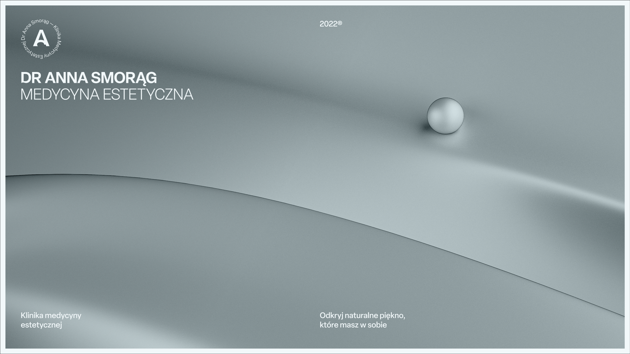
Dr Anna Smorąg
Services
Logo Design
Brand Design
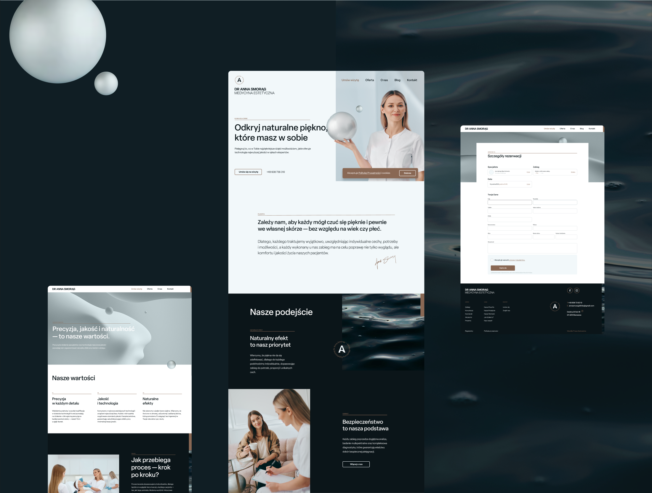
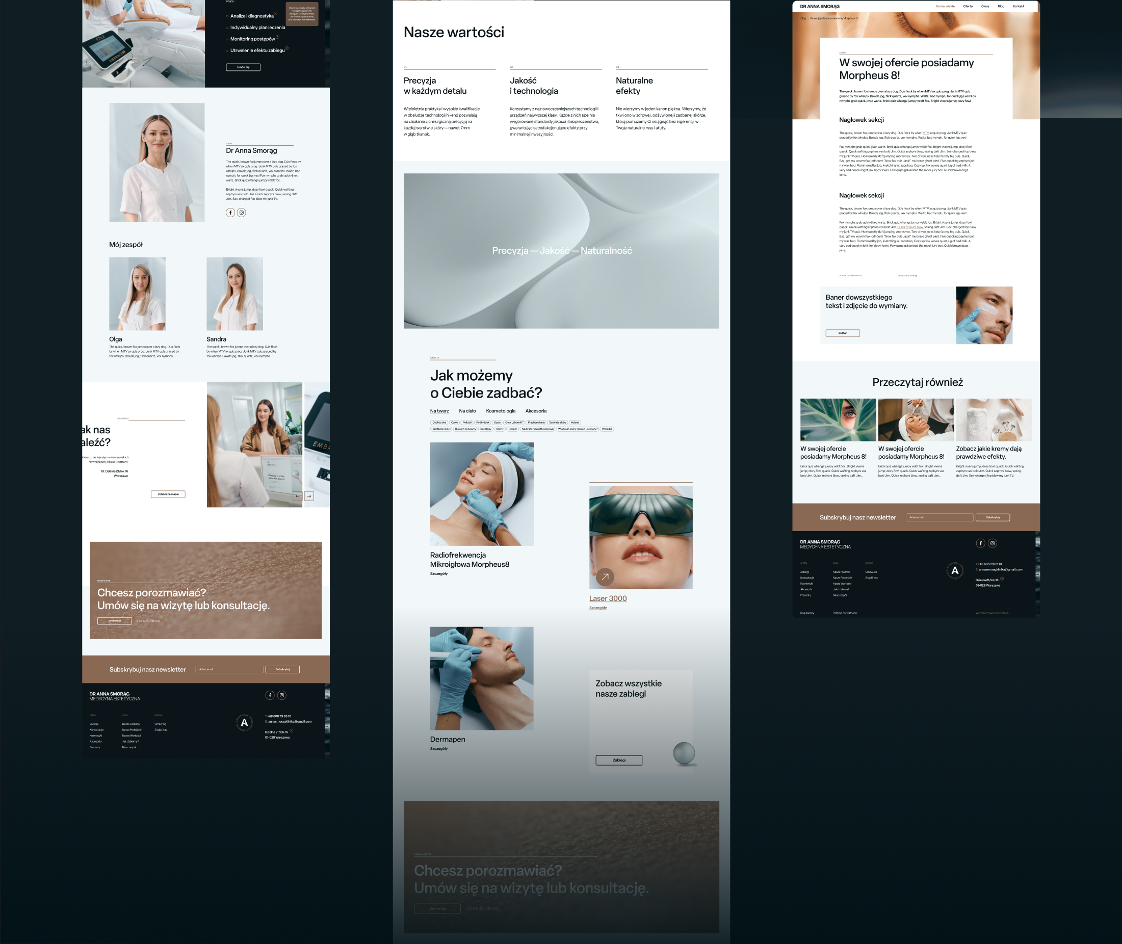
Web Design
Art Direction
Słowiński Paweł
Photography
Aleksander Salski
Challange
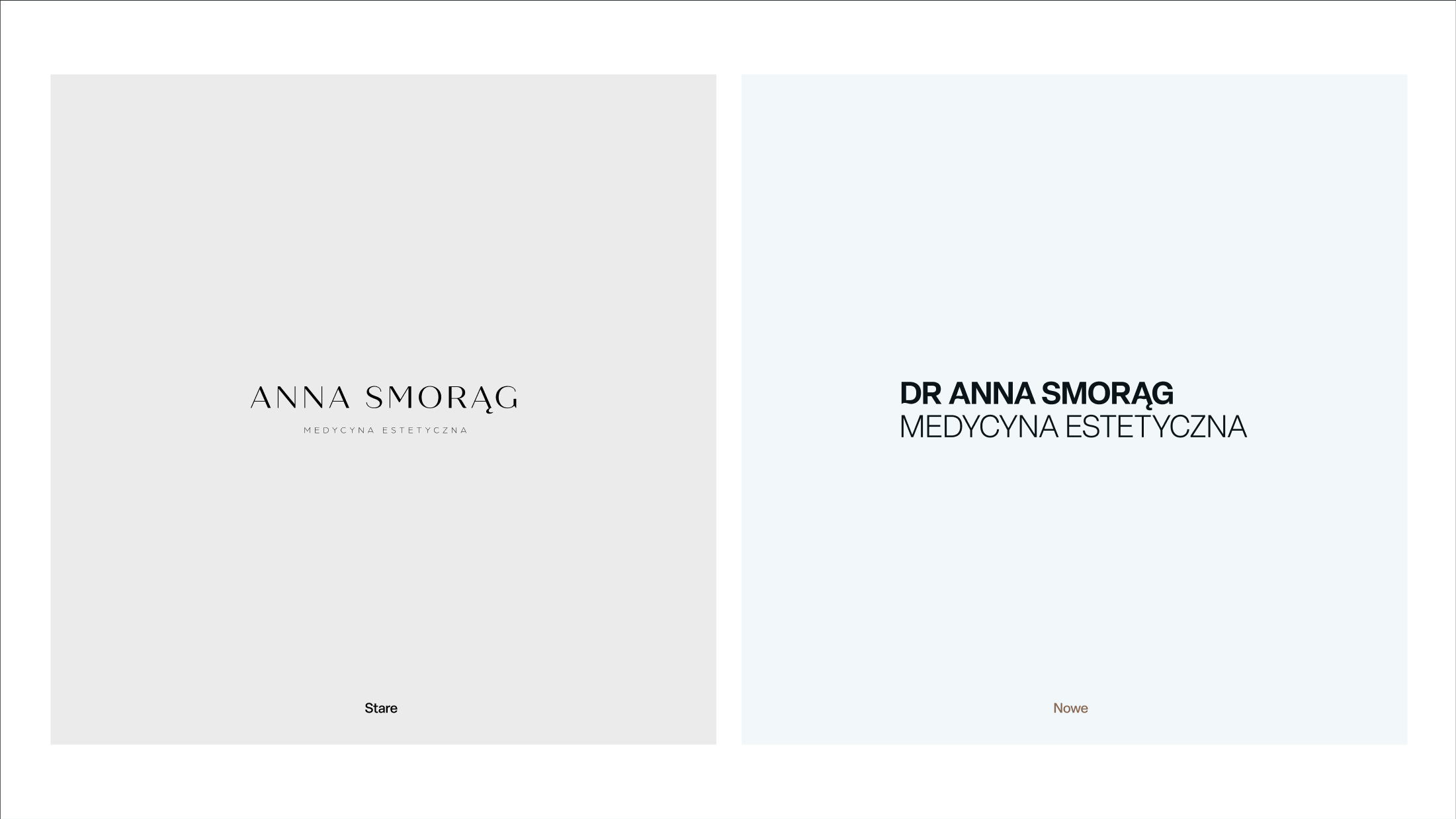
The brand lacked a distinct, professional image that could fully express its high-tech, holistic approach to skin care. Dr. Smorąg wanted the clinic’s identity to convey surgical precision — but without the scalpel. The goal was to position DASME (Dr Anna Smorąg Medical Aesthetics) as a place where care begins with understanding and prevention, not just treatment. Our task was to create a clean, professional visual identity that mirrored this philosophy.
Concept
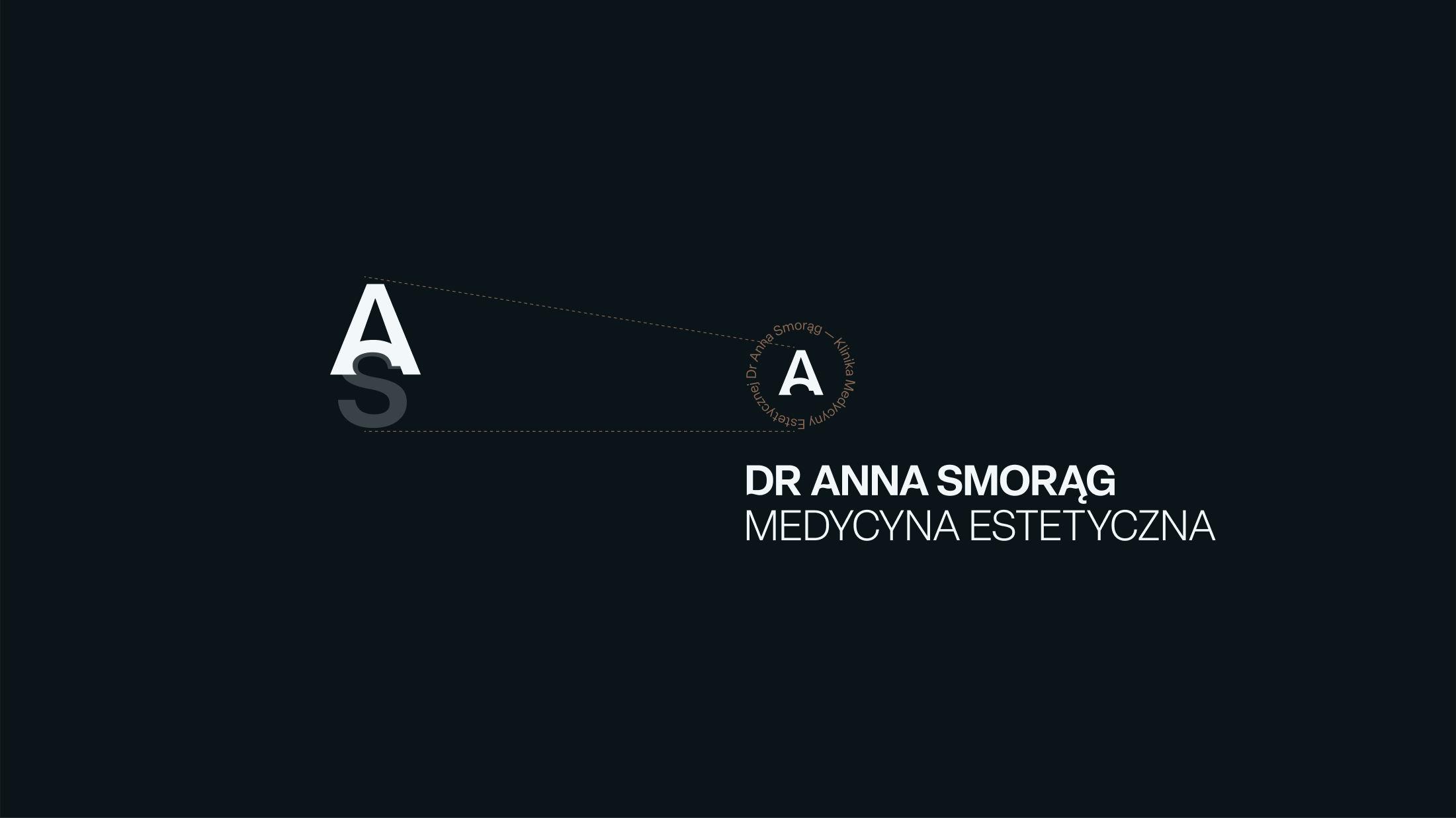
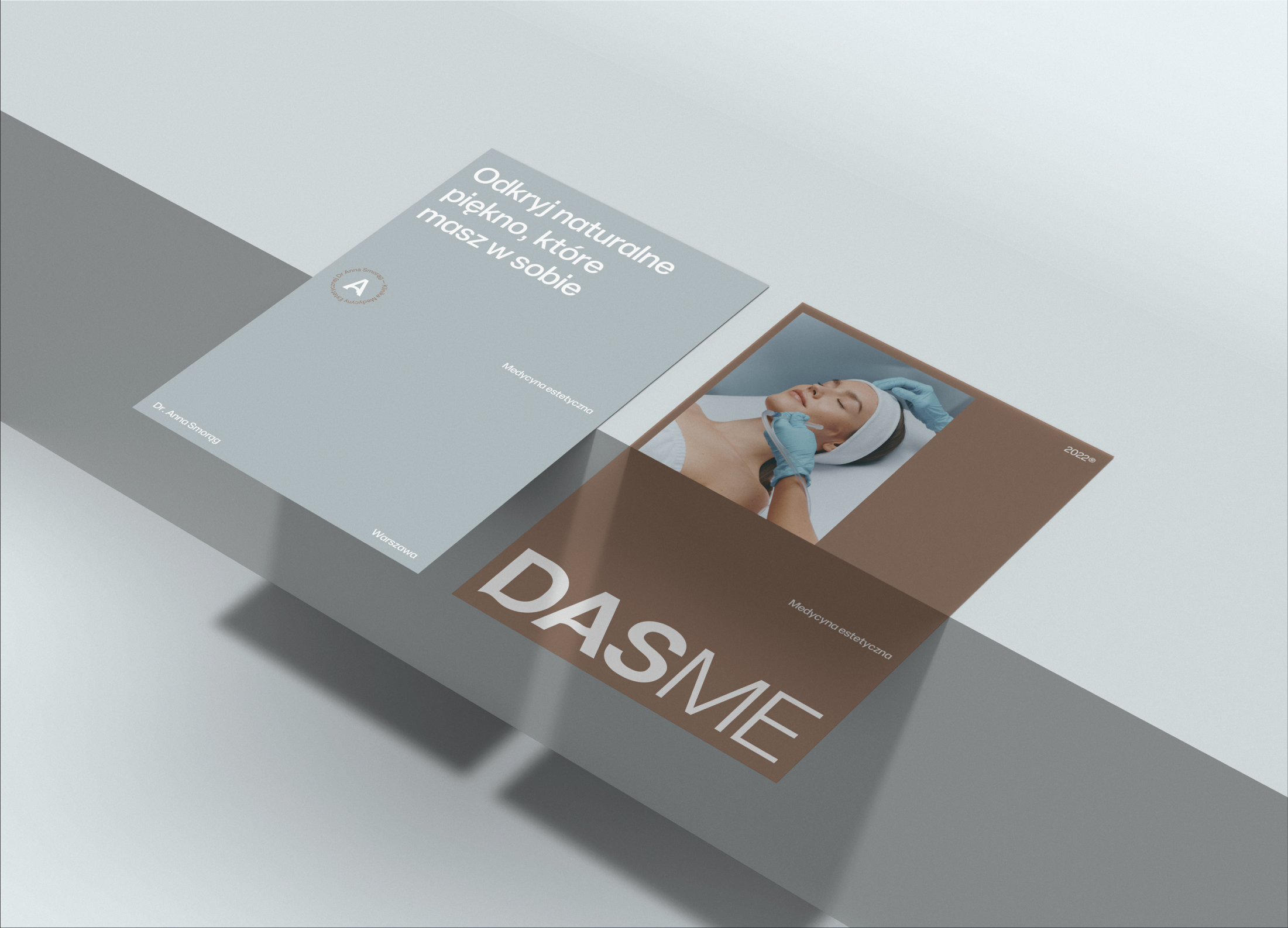
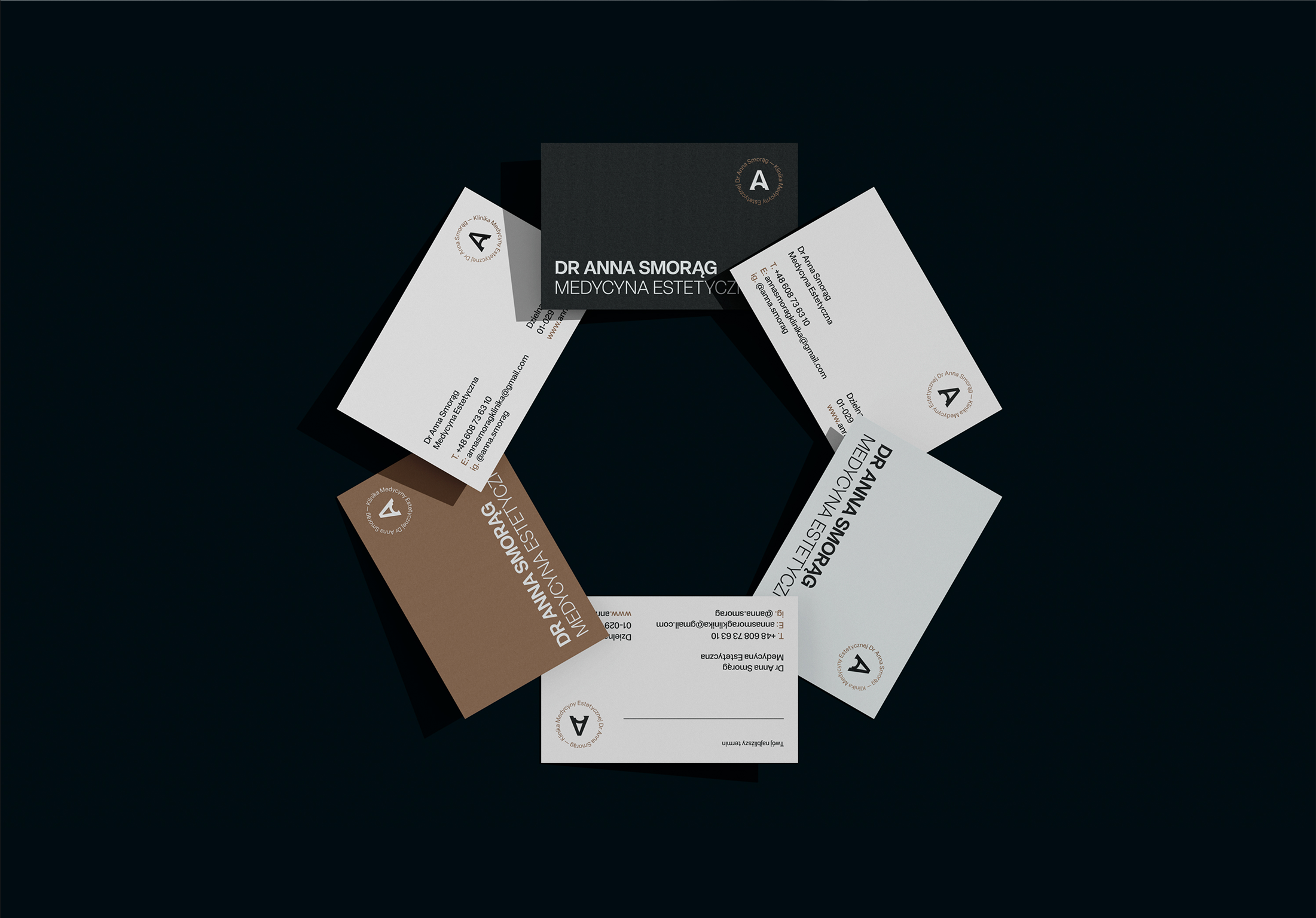
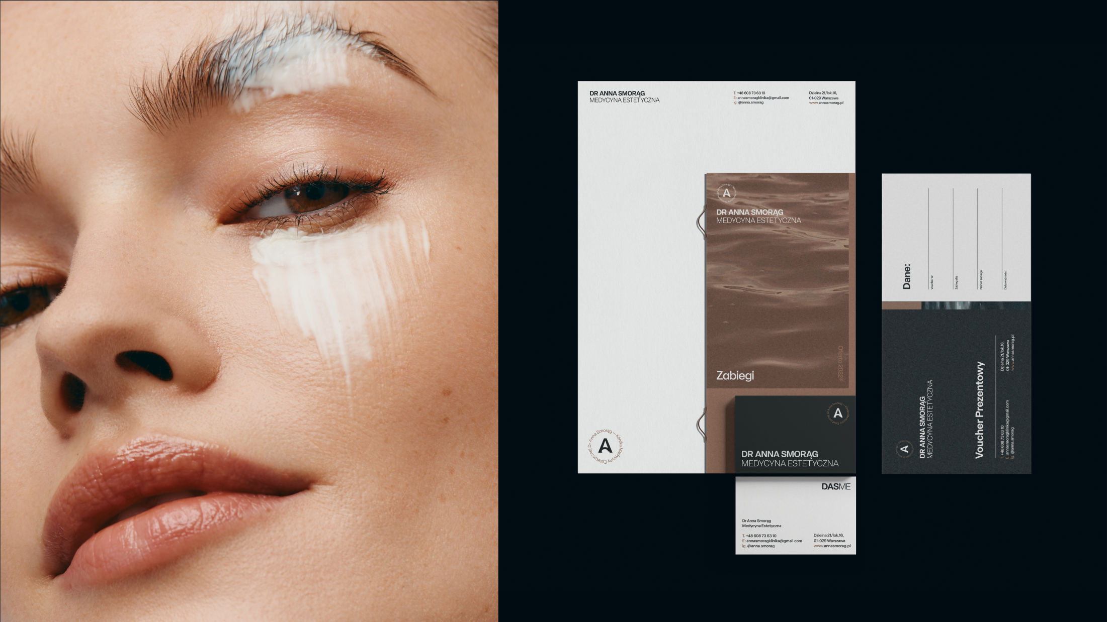
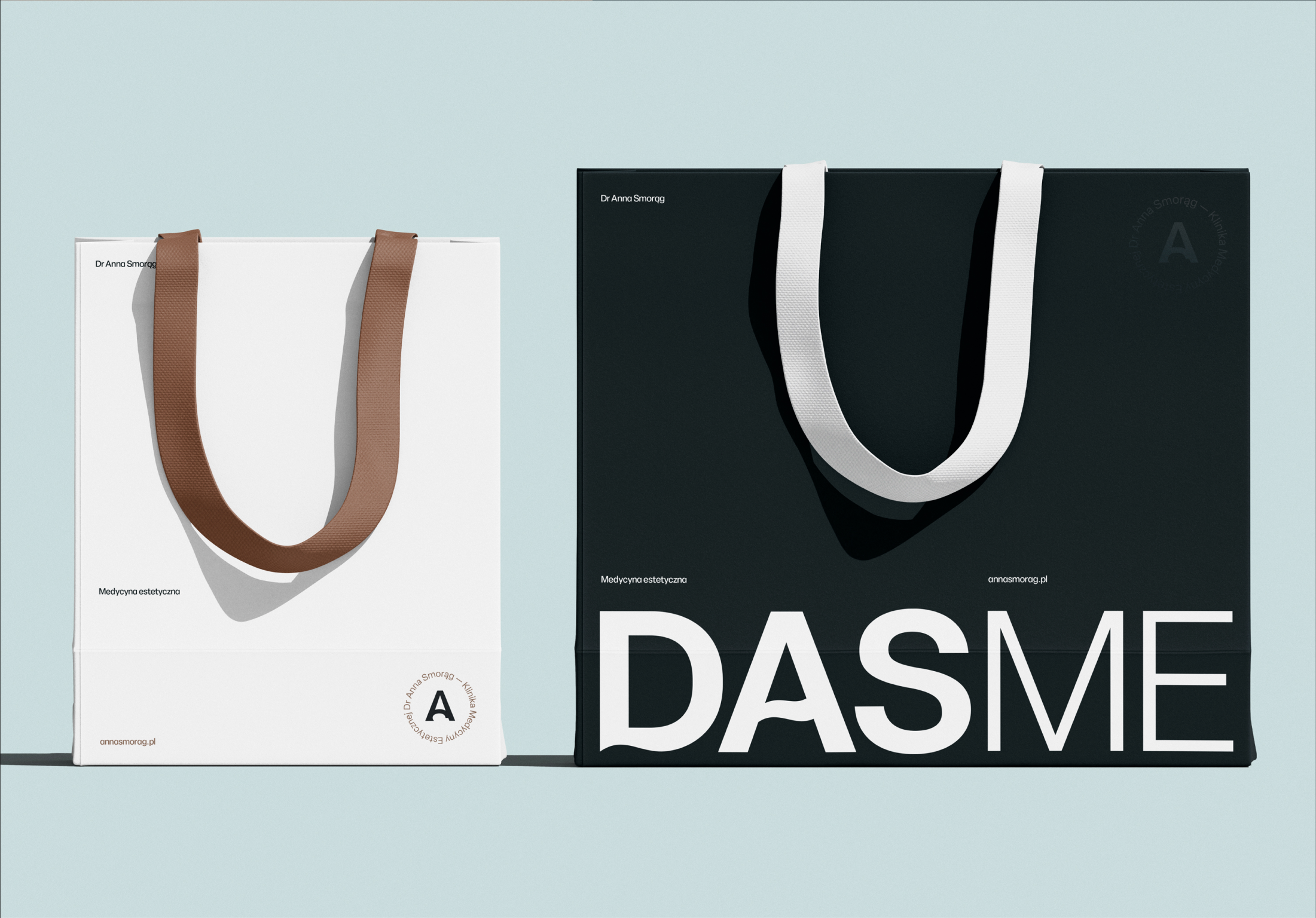
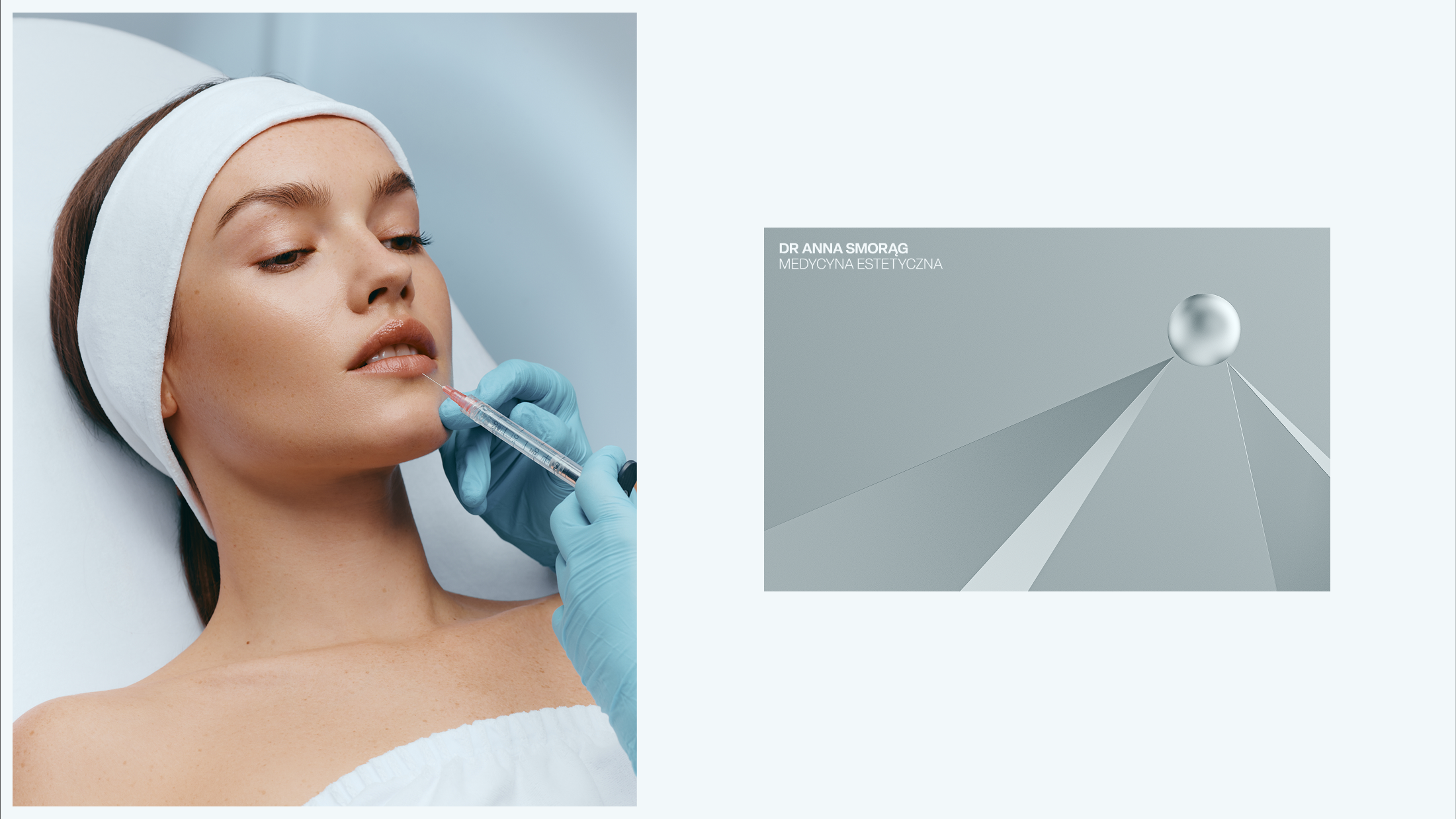
The identity was built on three symbolic elements: skin, glowing like precious metal; water, the essential building block of life; and stainless steel, representing reliability and precision. From these elements we developed the color palette and a minimalist symbol, incorporating the movement of water as a metaphor for vitality and flow.
Solution
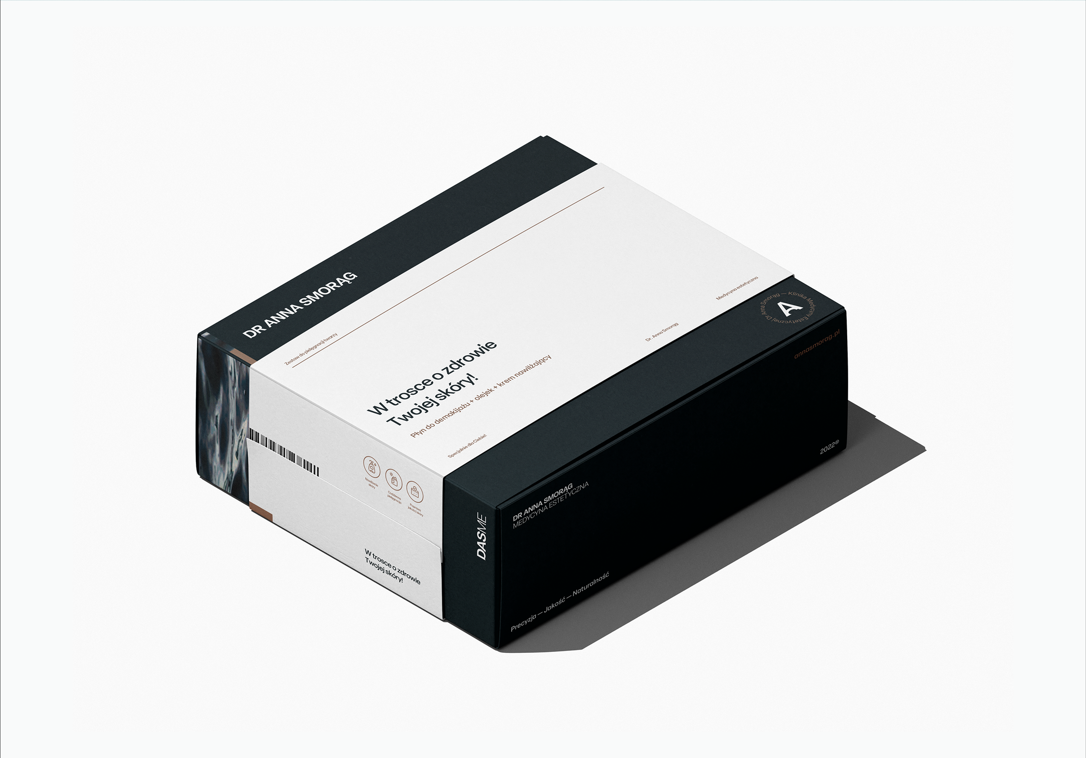
Given the wide range of applications — from business cards to cosmetics packaging and signage — the logo was designed to scale seamlessly across formats. Simplicity and minimalism became the foundation of a visual system that was both versatile and memorable. The idea of the Pearl Sphere served as a metaphor for natural beauty: something to be cared for, nurtured, and protected, rather than artificially polished.
Results
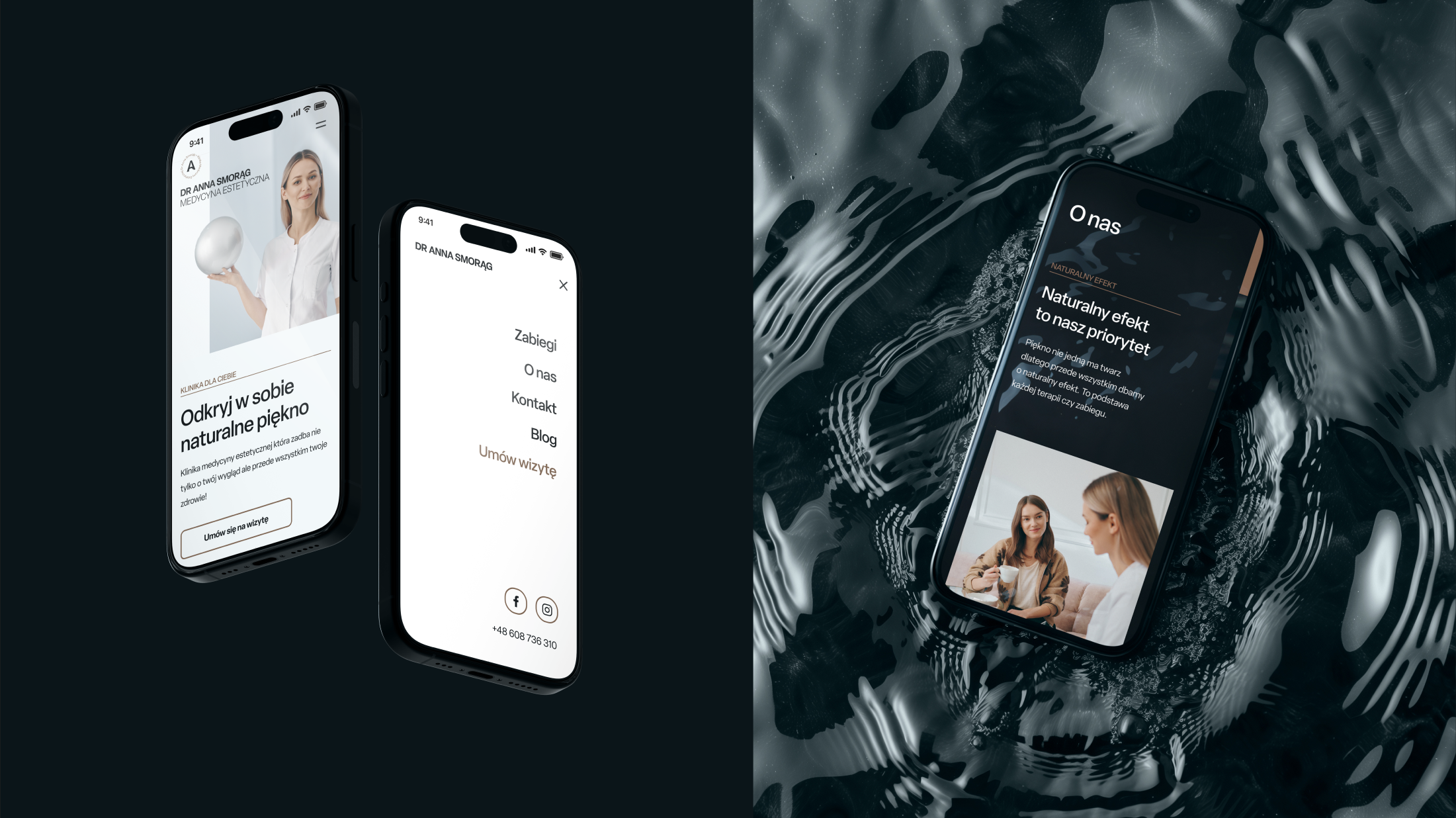
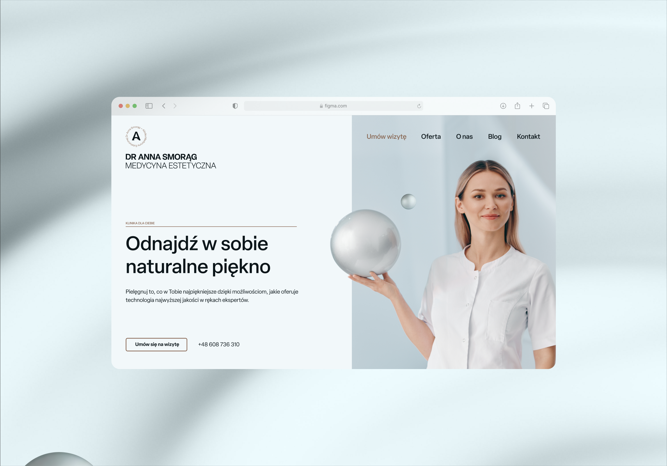
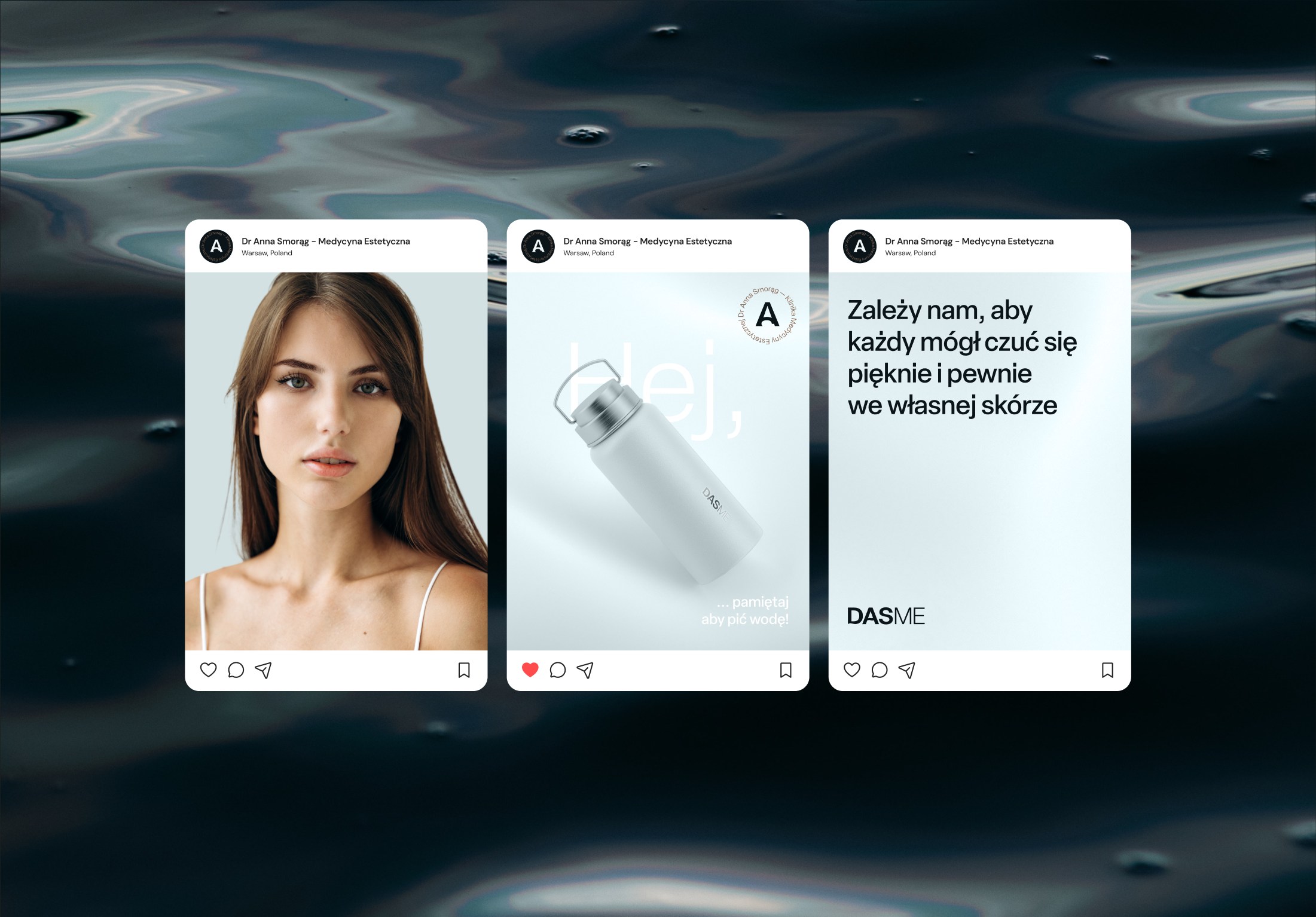
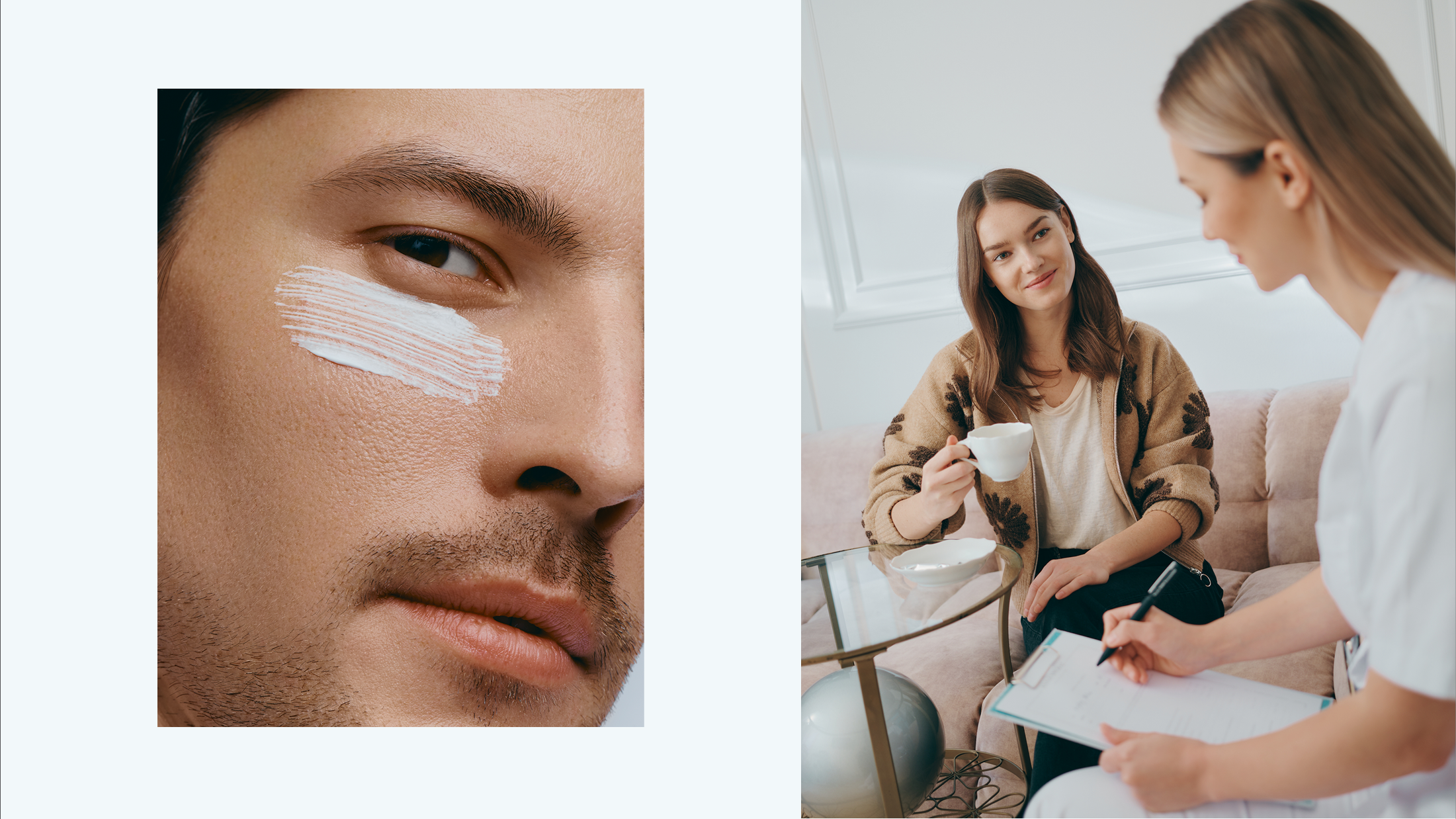
The outcome was a clean, precise identity paired with a direct, educational tone of voice. The brand gained a premium image expressed consistently across all materials — from clinic interiors to outdoor and digital campaigns. A dedicated photoshoot completed the system, providing authentic, elegant imagery that became the cornerstone of the website and social media communication.

Get in Touch
Słowiński Paweł | Creative Design & Direction
Handcrafted with Semplice